Tuesday, July 5, 2011

Movement and Motion

This is a photograph which exemplifies implied motion. It is a still shot of someone standing next to a freeway. They shot with image with a slow ISO in order to let as much light in as possible over a controlled period of time. It had to be shot on a tripod in order to make sure that the entire image was not blurred. The blur of light that remains is of cars going by at a quick speed in both directions. This image is a great example of linear perspective because the eye is drawn into the center because of all of the lines using various vanishing points which we cannot see. This image is also an example of binocular disparity because each eye is made to focus on individual things. It is very hard for us to look at everything all at once because our eyes want to focus on only one thing at a time to truly understand what we are seeing. These lines draw are eyes in both directions at the same time which makes us focus on one at a time. There is also a texture gradient that is being applied to this image because of the blur lines versus the straight lines. The contrast of types of lines are perceived as different gradients layered over each other.


"Sweeping it under the carpet" is a famous street art piece by Banksy. In this work he created the illusion of implied motion with spray paint on the side of a random street in the U.K. This is a great image because when the viewer looks at this they perceive it as if someone has actually lifted the wall up and was sweeping the dust under the carpet. The reality of the situation is that it is a 2D image which looks 3D. He has created depth on a flat surface which has created a very complex illusion. The truly amazing part about works of art by Banksy is that he creates all of it at night while hiding in the shadows mainly using spray paint and stencils to help quickly executed piece of art. This image is shown as an overlap which looks as if there are many things in front of each other. It also uses relative size to help create the illusion that she is sweeping the dust into a smaller corner which is behind her.


Tone and Color


Tone is being shown in both of these images by focusing on the contrast of the red and the black. The shoes are the same version in both images yet the tones of the images are different mearly by presenting the player doing different things. The top image has a very dynamic tone because the player is flying through the air with his classic tongue hanging out. While the bottom image has a very relaxed tone and if he has just finished a great work out and now its time to slow it down. Color is being utilized in this product by having all of the color schemes resemble Michael Jordan's team colors. Red, black, and white are used in various color patterns to achieve new shoes looks while still keeping the same actual shoe intact. This is also a great marketing strategy because you can sell more products by simply rearranging the colors. The strategy of understanding why those colors work so well can be understood by seeing red and black and key components of the color wheel. By contrasting these two colors it makes the other one pop out at us.

Monday, June 27, 2011

Skateboard Magazine Advertisement

This is an advertisement for Thrasher magazine that was inserted in other skate magazines and skater related printed materials. I choose this image to look at because of the lines that stood out. There are numerous lines in this image that are pulling my eye away from the vanishing spot by using the skater. The text on top of the image is really top heavy and pushes my eyes to look underneath it. When I look down at the skater I automatically notice that eh seems to be coming at me at a very fast pace because of his dynamic position. The little Thrasher logo in the bottom right corner also helps to push my eyes upwards to focus on that little section of lines to really make the focal point of the ad pop out at you.

Skateboard Magazine Cover Design

This image is the cover of the August 2008, Thrasher magazine. I have chosen to focus of Thrasher magazine covers because they tend to be great examples of line and direction. This particular image also is a great example of scale because of the size of the skater, staircase, and text on the cover are all contrasting each other. The text is smaller and behind the skater to show that he is the main focus of the image even though he is at the top of the image. The staircase is a great example of lines because it shows the viewer where to look while there is a gap in the center of the image. This gap is utilized as a marker to show the direction of the skater because of the gravity of his alley he must come down. This image is very dynamic because of the action of the skater.

Skateboard Magazine Cover Design

This is the May 2010 cover of Thrasher magazine. I believe this image is a great design that utilizes line and direction to really pull the viewer into the picture. The lines of the stairs pull our eyes into the center of the image where the staircase uses another set of lines to direct our attention to. Having the skateboarder at the top shows which direction he will be traveling which leads into the direction category. The direction of the images plays off of the lines by combining in the image to complete the viewers understanding. This magazine has been doing these type of action shots for decades and only seems to be getting better.

Design Success and Failure in Relation to Syntactical Guidelines

This deck is a modern design aimed at maintaining its functionality while creating a new style of art at the same time. The deck is unique because of the elaborate swirls all across the board as well as wheels that change colors as they spin. The only true failure of this deck is to the traditional skateboarder who intends on performing tricks. Not to say you can't jump this deck but it would be more difficult because of all the open spaces in the deck.

This green Element deck is a traditional deck with a earthy graphic laid on the bottom. This is traditionally what I have always seen as my nice because I have always been involved in the skating community as well as have a love for the same type of graphics which I have always seen being sold at local deck retailers. This Element board is successful in its design for the traditionalist because it holds the typical size and a beautiful, clean graphic. This type of board is what is needed to perform tricks and be able to ride the board without fear of falling because of some open spaces in the deck. This is another successful design by the people @ Element.

Monday, June 20, 2011

Visual Thinking Research

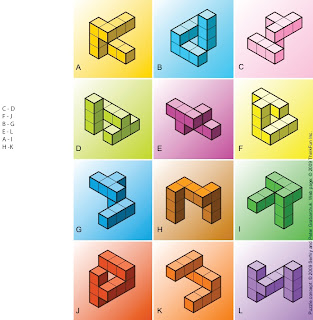
This puzzle was done by my girlfriend. Her explanation of how she came to her conclusion was that she simply was able to visualize the rotation of the blocks in her mind till she was able to match up the appropriate pairs. She is an artist and always had a keen eye for detail so it might be possible that her ability to visualize space is what helps her as an artist.
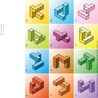
This block puzzle was all about finding the same pattern of blocks and matching them with their equal somewhere on the board. There are 12 images to match up. I realize that all these block patterns are rotated in different positions but because they are relative blocks with defined parts we can perceive it the patterns easier.
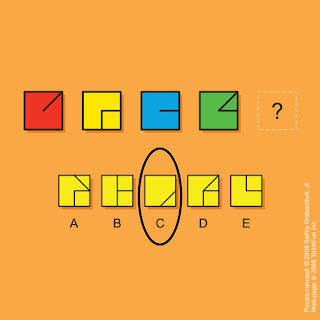
This puzzle was my first attempt at the puzzle. I looked at the lines and the squares. I noticed that there had to be some sort of pattern laying in the lines. I noticed that the line was constantly moving and changing shapes so I looked for the option that followed the most logical pattern I could find. I went with C because I thought it followed the pattern which I created in my mind. It was an optical illusion that I had created in my mind by looking for something that wasn't there.


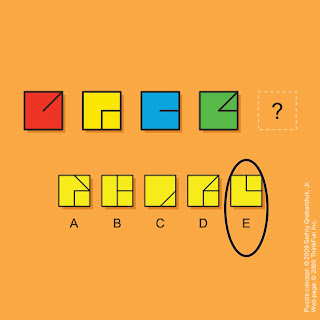
This was a very difficult puzzle for me. I first started off by noticing the obvious things first such as the basic shapes and tried to notice if the color played any part of the puzzle. Then I started fixating on the lines in the squares to see what patterns they seem to follow. This was the hardest part of the puzzle for me now because nothing popped out at me initially. I began looking at the options as if I already had a predetermined idea in mind which actually made it a bit harder because I was looking at the puzzle somewhat close-minded. I started looking at just parts of the squares as if the were separated pieces laying over other pieces the answer randomly jumped out at me as if I had seen in the entire time. The puzzle and the pattern is numerical and basic, 1, 2, 3, 4, and the answer is 5. If you eliminate the left half of the squares it is easier to see the answer.


Friday, June 17, 2011

Visual Perception

Top-Down Visual Processing

http://psychology.uwo.ca/faculty/goodale/research/

Top-Down visualization is all about needing to see what we need when we need it. This image is a optical illusion which is of two faces with one concave and one projected. The projected face shows a normal face, which we see as standard yet the concave face stretches the dimensions and guides our eyes to look at it as if it were stretched out. It almost seems as if the concave image has depth but it is not there. We make the connection in our brain to see what we want to see but the fact is the image is not complete. Top-Down visualization is all about utilizing our attention span to focus on our goal of perception.


Sunday, June 12, 2011

Interactions Between the 3 Levels


Exercise 5

REPRESENTATIONAL

It is a work of art the represents hands and a city. It denotes the idea of a society living in the palm of our hands. This image is black and white which eliminates excessive colors in order to focus on the detail of the hands and the city. Since the houses are in the palms of the hands coming out of the water that could almost be seen as a god like feature. It relates to the other two levels because it is a truly abstract design while also being extremely symbolic.

ABSTRACT

This is a very abstract design because it is unrealistic while also being representational of actual things the audience is aware of. The idea of a house is not a new concept but the idea of those houses being held up in the sky above the water by a giant pair of hands is. This design is focusing more on promoting a message with their art rather then just being a good drawer. The idea of being abstract allows the artist to put a message directly into their work without rubbing their nose in it. This image is related to the other two levels because it is a representational work which utilizes those basic things with a symbolic meaning such as hold up the city or holding the city in the palm of your hands.

SYMBOLIC

This design is very symbolic because it shows two giant hands coming out of the water and lifting up the city and holding it in their palms. This idea is very god like because it is as if a greater being could only come from under the water to do such a thing. The idea of the hands lifting the city up is also symbolic for people helping people in their own society. Symbolism is all about understanding the meaning of something without directly showing it. This idea is also very similar to abstract art and representational art.


Friday, June 10, 2011

Symbolic Meaning


Symbolic Art

Symbolic art is when an artist utilizes the viewer’s ability to recognize something that signifies something else. In this image the artist paints St. Michael slaying an enemy. The artist portrays the Angel as glowing and magical looking while he portrays the “enemies” as dark and scary. This image shows the Symbolic representation of heaven and hell, of good and evil, and of right and wrong. The spear and the Angel symbolize the fight for good and the protector of the people while he is slaying down the wicked and condemned. This religious symbolic artwork achieved its goal not only because of its message but emphasized it with its immense canvas size. I believe a symbolic artwork is something that calls to the viewer in such a strong way that it changes their lives. I feel so strongly about this work of art that I got it tattooed a few years ago to represent my passion to understand the good and evil parts of the world and my life.

Abstract Meaning

Abstract Art

Abstract art is all about combining form, color, and lines into an artwork that does not follow the typical Western Art forms. This image above, by Salvador Dali, plays on the idea of combining multiple images to create a larger image. Dali was such a talented abstract artist that he made 50 individual paintings and combined them into one large image which gave the viewer 52 different paintings to look at in 1 masterpiece. Abstracting an image gives the artist the ability to play with a person’s mind because everyone sees things in different ways. He was very successful in this work because it stimulates the viewers mind and gives them something very interesting to look at, depending on what they want to see.

Representational Meaning

Exercise 3

Representation Art

The tiger face is a work of art that is representational because it depicts an animal without actually being an animal. The viewer perceives this to be a tiger head but it is actually made out of clay. The layers of the face give it depth and look “realistic”. Looking similar to a tiger was the artist intention but he did not intend to put an actual tiger into his artwork. A true representational artwork will allow both the viewer and the artist the ability to see an object and think that it is something other then the raw material.