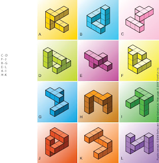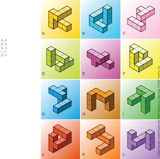
This puzzle was done by my girlfriend. Her explanation of how she came to her conclusion was that she simply was able to visualize the rotation of the blocks in her mind till she was able to match up the appropriate pairs. She is an artist and always had a keen eye for detail so it might be possible that her ability to visualize space is what helps her as an artist.

This block puzzle was all about finding the same pattern of blocks and matching them with their equal somewhere on the board. There are 12 images to match up. I realize that all these block patterns are rotated in different positions but because they are relative blocks with defined parts we can perceive it the patterns easier.

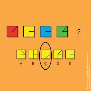
This puzzle was my first attempt at the puzzle. I looked at the lines and the squares. I noticed that there had to be some sort of pattern laying in the lines. I noticed that the line was constantly moving and changing shapes so I looked for the option that followed the most logical pattern I could find. I went with C because I thought it followed the pattern which I created in my mind. It was an optical illusion that I had created in my mind by looking for something that wasn't there.

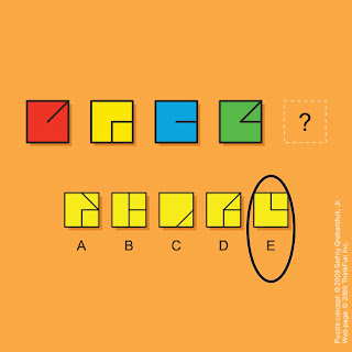
This was a very difficult puzzle for me. I first started off by noticing the obvious things first such as the basic shapes and tried to notice if the color played any part of the puzzle. Then I started fixating on the lines in the squares to see what patterns they seem to follow. This was the hardest part of the puzzle for me now because nothing popped out at me initially. I began looking at the options as if I already had a predetermined idea in mind which actually made it a bit harder because I was looking at the puzzle somewhat close-minded. I started looking at just parts of the squares as if the were separated pieces laying over other pieces the answer randomly jumped out at me as if I had seen in the entire time. The puzzle and the pattern is numerical and basic, 1, 2, 3, 4, and the answer is 5. If you eliminate the left half of the squares it is easier to see the answer.
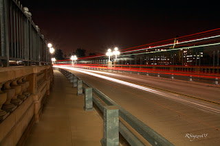 This is a photograph which exemplifies implied motion. It is a still shot of someone standing next to a freeway. They shot with image with a slow ISO in order to let as much light in as possible over a controlled period of time. It had to be shot on a tripod in order to make sure that the entire image was not blurred. The blur of light that remains is of cars going by at a quick speed in both directions. This image is a great example of linear perspective because the eye is drawn into the center because of all of the lines using various vanishing points which we cannot see. This image is also an example of binocular disparity because each eye is made to focus on individual things. It is very hard for us to look at everything all at once because our eyes want to focus on only one thing at a time to truly understand what we are seeing. These lines draw are eyes in both directions at the same time which makes us focus on one at a time. There is also a texture gradient that is being applied to this image because of the blur lines versus the straight lines. The contrast of types of lines are perceived as different gradients layered over each other.
 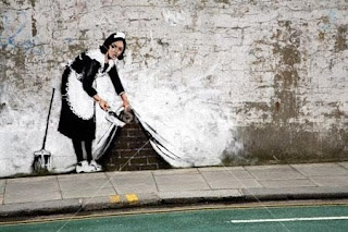 "Sweeping it under the carpet" is a famous street art piece by Banksy. In this work he created the illusion of implied motion with spray paint on the side of a random street in the U.K. This is a great image because when the viewer looks at this they perceive it as if someone has actually lifted the wall up and was sweeping the dust under the carpet. The reality of the situation is that it is a 2D image which looks 3D. He has created depth on a flat surface which has created a very complex illusion. The truly amazing part about works of art by Banksy is that he creates all of it at night while hiding in the shadows mainly using spray paint and stencils to help quickly executed piece of art. This image is shown as an overlap which looks as if there are many things in front of each other. It also uses relative size to help create the illusion that she is sweeping the dust into a smaller corner which is behind her.


